

We’ve expanded status page color customization to give you more control over your branding and support a wider range of color combinations.
Previously, you could select one primary color and one text color for each theme. These colors were applied across multiple elements, which could make it difficult to achieve the right contrast or match certain brand styles.
Now, you can customize individual parts of your status page separately for both light and dark themes.
Depending on your selected header style, you can choose colors for:
- Header background
- Header text and the Report outage button
- Subscribe to updates button background
- Subscribe to updates button text
- Buttons, links, and controls, including radio buttons, checkboxes, and layout switchers
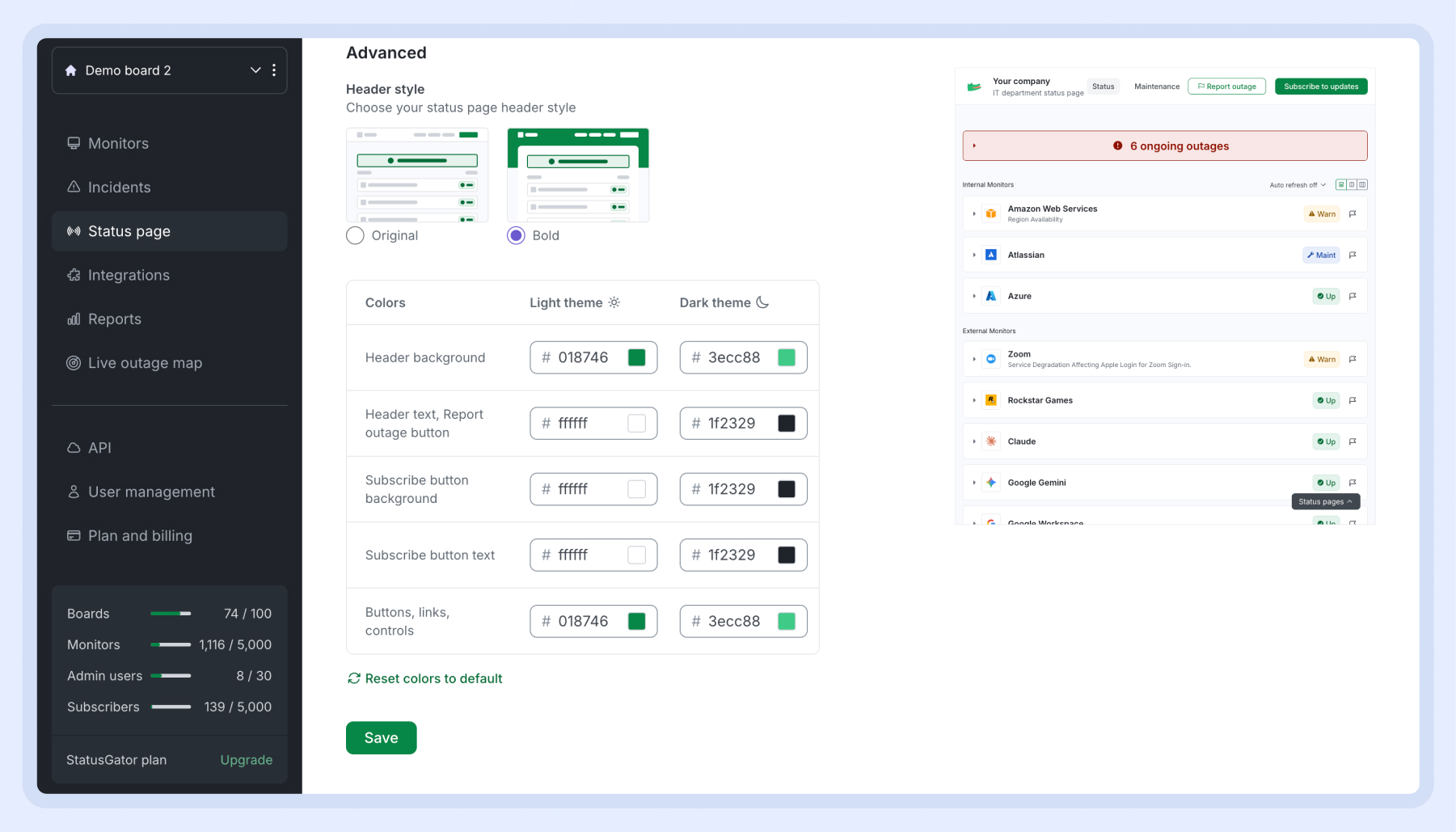
This additional flexibility makes it easier to create a status page that fits your brand while keeping text, buttons, and controls clear and readable. For example, you can use a dark header with light text, create a contrasting subscribe button, or choose different color combinations for light and dark modes.
You can also see your changes in the status page preview as you customize them. If you want to start over, select Reset colors to default.
To try the new options, open your status page settings and find Colors under Advanced.