
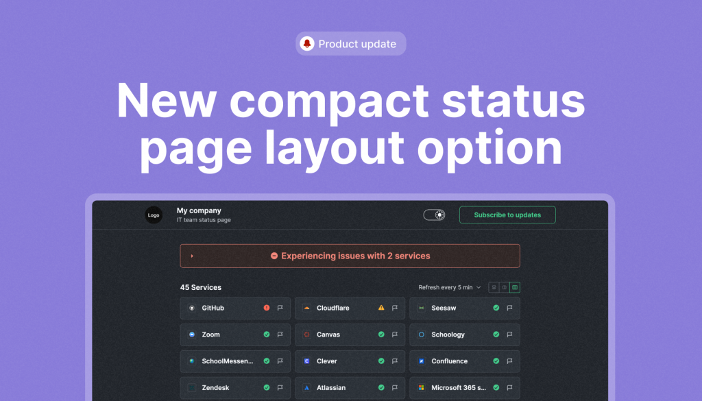
If you have a long list of monitors to keep track of, we’ve got you covered. We’ve added a 3-column option for a more condensed view, enabling you and your team to efficiently scan through your monitors on the status page with ease. You can choose any of the layout options as your default, but individual users can still choose their own theme which is remembered.
Let’s review all three options together to recall and compare their features, as the are slightly different.
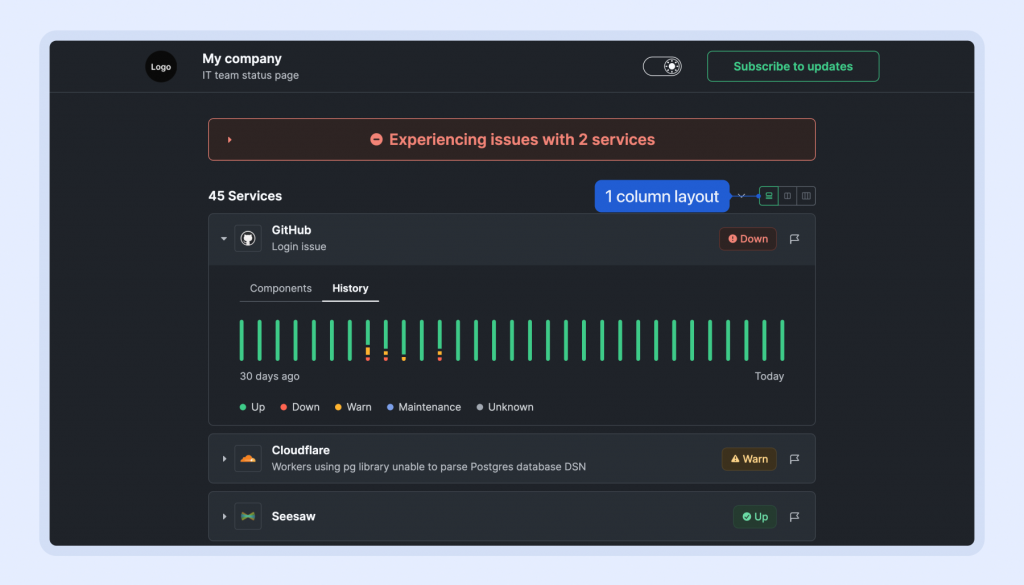
1. One-column layout – in comparison to other layout options, users can view the list of all monitors, their full status name, and check component statuses along with the uptime graph for the last 30 days.
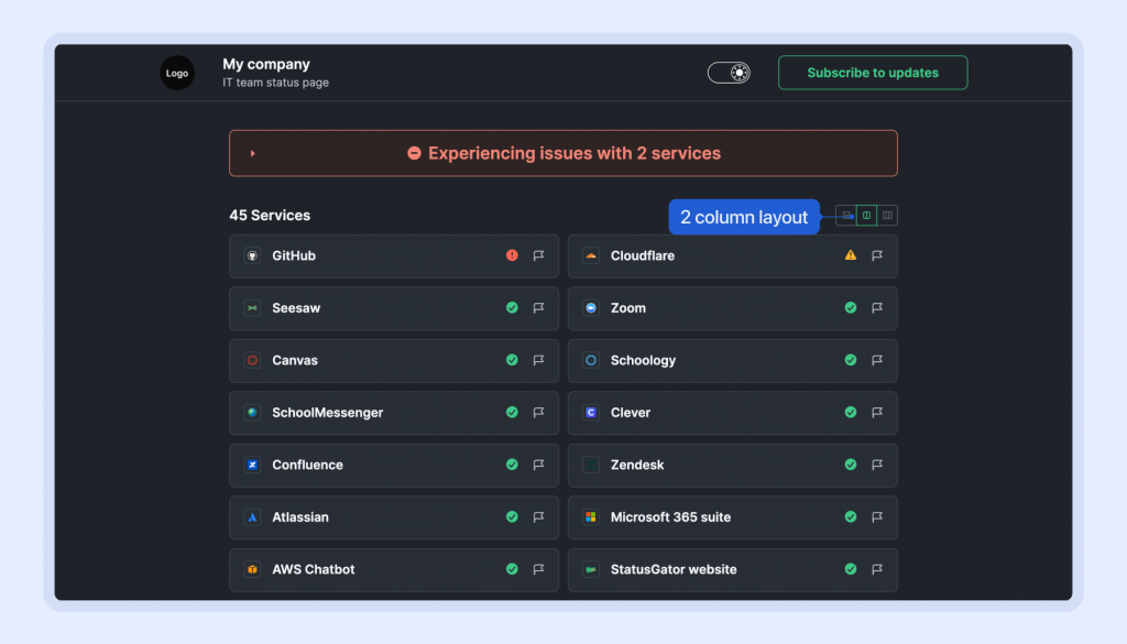
2. Two-column layout – this simplified version presents users with the monitor’s name, its status, and a preview of the issue description. However, users cannot access issue details, component status, or uptime history. Despite this limitation, it offers an overview of all monitors, allowing users to quickly scan and identify affected ones. This layout is particularly convenient for monitoring a large list of services.
3. Three-column layout – This new option offers an even more compact layout, mirroring the functionality of the two-column version but with a tighter display. This choice is ideal for users who utilize large-screen devices and monitor a substantial number of services, ensuring efficient navigation and management.
